Invitations and Event Promotion

The wonderful thing about events for an in-house designer is the opportunity to expand beyond the brand and spread out to create something new for an event.
Driving Engagement with Self-mailers

During my tenure at SAY, I was privileged to be given the freedom to innovate fresh and vibrant experiences for our donors.
“I am SAY” Campaign

This evergreen campaign, which correlated with brand refinement work, grew out of SAY’s core value of “We are in it together.”
3-40 Year-end Campaign
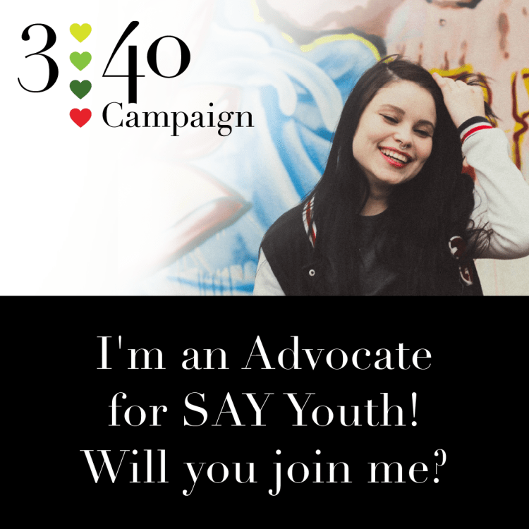
In 2019, a staggering 340 youth under the age of 25 were homeless in Sonoma County. To address this critical issue, we initiated the 3-40 Campaign, setting a fundraising target to highlight the number of youth affected. The campaign was so successful we used the branding for an additional two years.
Read more and see campaigns
Five Years Raising Awareness and Funds
For five-and-a-half years, I had the honor of spearheading marketing initiatives for Social Advocates for Youth (SAY). It was immensely rewarding to leverage my creative talents and expertise to support SAY’s mission of providing housing, counseling, and job opportunities to at-risk youth. The portfolio showcased below highlights the extensive range of projects undertaken, including gala invitations, year-end appeals, thank-you cards, print advertisements, and beyond.
Working in the arena of human services presents certain challenges when using images of the individuals served. We received feedback from our staff that our youth often suffered a setback after we shared their stories publicly in photos and videos. To protect the progress our youth made we started using stock photography. My years as a photography instructor reviewing hundreds of images quickly allowed me to scour free and low-cost stock catalogs for images of youth that honestly represented the youth we serve. Our staff also shared with us that the “poverty-porn” utilized by many human services nonprofits didn’t represent who our youth actually were. Our youth are full of spirit, potential and hope, but in a bad spot. I curated a library of images that were hopeful and honest in representing this reality.
Mental Health Campaigns
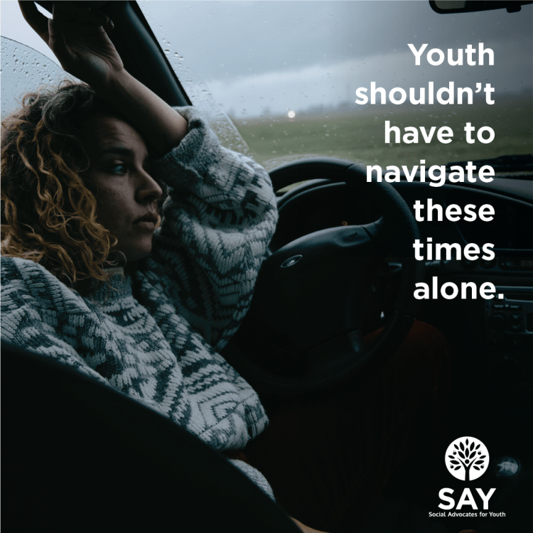
SAY offered essential mental health services to youth under 25 years old, particularly crucial in Sonoma County after multiple years of fires, floods and the pandemic. We developed collateral raising public awareness about services available to youth, providing resources for adults to assist youth, and outlining ways the community could contribute to SAY’s vital work.

The Hope Society Logo

This logo project was a test of my skills for the position at SAY. The Hope Society was an endowment fund to support the building housing SAY’s Dream Center.
I wanted the logo to allude to the building the fund was meant to support, while integrating the color palette and some of the shapes from the main logo. While the logo was never used a enjoyed the process and was very happy with the options I provided. And I got the job.
SAY Branding Refinement

SAY had been gifted a logo a few years before I joined the team. While bold and identifiable, it had some structural issues. A full brand rework was not fiscally feasible, after a few years of building trust, the management team allowed me to refine the branding.
Other Projects
SRJC CTE Celebration
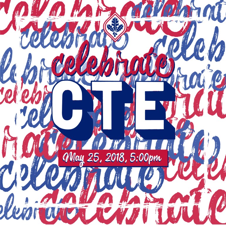
Design Challenge:
The client, SRJC, needed an invitation for their Career Technical Education Celebration. The event is the culminating event for students participating in career training programs. This event is separate from the traditional graduation ceremony and has its own identity. It is a fun, music filled event where the honorees often come in costume or themed dressed. The college wanted something that conveyed the fun but maintained the branding of the college.
California Natives Wordmark and Packaging
Design Challenge:
Client needed an identity upgrade as they expanded their sales from wholesale to retail.
Tasks:
- Identity creation that demonstrates they are not newcomers to the marketplace but a longtime player.
- Packaging design that differentiates the brand among other seed brands.
Solstice Aleworks Branding
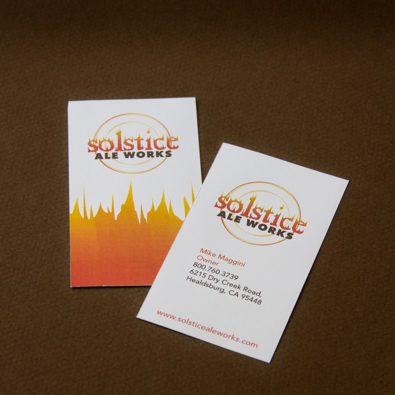
Design Challenge:
The client was in need of a bold wordmark for use in a new restaurant and brewery venture. Newspaper ads were also needed for promotional purposes.
Have a project in mind?
